


Updating the Lantern Homepage - 2022
This project was cross-departmental, big, and valuable. All of the aspects about UX that I love. We had a couple iterations of this homepage since I started at Lantern in 2020, but this one was the culmination of a few things listed below.
Our updated Brand Book was completed and the page no longer fit the messaging and style
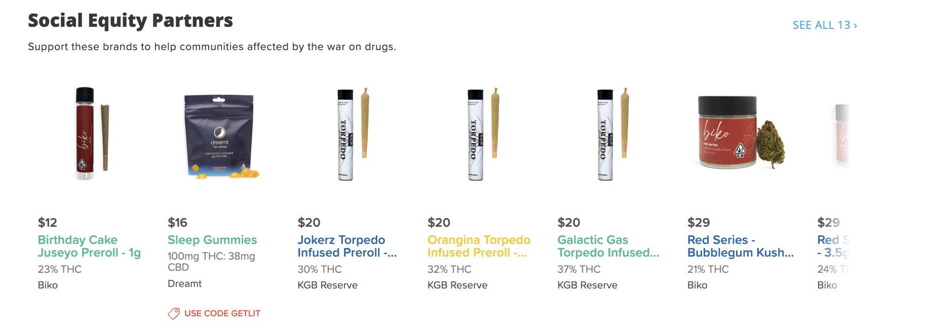
Category management had completed a lot of projects to make shopping easier (shop by feelings, strain guides, and other collections).
My visual design team and marketing needed an easier and much more efficient way to update relevant content.
We had a year and half of data from the first redesign that informed a lot of the decisions here.
The process for this project was as follows:
Identify requirements: Work with product to immediately understand the goal and scope of the project before pen-to-paper begins.
Work with analytics to pull data on baseline metrics.
Gather inspiration, crowd-sourced with Marketing and other designers.
Begin design with sketches/wireframes and get sign off on the components from key stakeholders (Engineering, Product, Marketing)
The goal: Design an on-brand homepage that allows marketing and design to update content regularly while increasing top-funnel metrics
My role: Lead Designer, Creative Director
Success criteria: Increase in address capture, engagement + decrease in bounce rate


Inspiration dump
I asked everyone to provide some screenshots of the components they liked seeing from their favorite landing experiences. It didn’t need to be cannabis related, but it is nice to compare a few competitors to what we might want to do.

Communicating with stakeholders
For the wireframes/mock ups, I decided to highlight the areas that were going to be able to be updated by Marketing so they had a better understanding of how it would all work. Any of the pink highlight you see is completely managed by the CMS marketing used.
Note: Updating the header nav and footer was out of scope for this particular project.

have more fun
When we were sourcing inspiration and getting feedback from stakeholders, many mentioned wanting to have more fun with our homepage. We decided to break the mold of the traditional “value prop” component that had a numbered segmentation and always ends up being pretty boring.
Additionally, a few sites we looked at had a fun ticker-style scroller to communicate value props more often.
Also keeping some visual language across platforms helps establish that brand consistency as you can see the category sections here (identical to our iOS shopping experience).

cross-functionality
This section pulled from the great category management work that was completed throughout the year. Through user research, we found that many consumers shopped by a desired effect or feeling so we decided to put that functionality higher on the page, just below the most used shopping patter: categories.
The pink highlight here denoted that the full component’s visual style was customizable.

SEO implications
Another aspect of this project was increasing the SEO value of our homepage. I worked with the SEO team to design a component that was useful for consumers, our SEO team, and matched the brand styles.
I asked engineering that this be built with the FAQ markup that Google loves to see and we began showing on the Google SRP as the FAQs for “weed delivery” and similar search terms.
The page in action
You can wee the page in action in the video below. I recorded desktop to allow for more space to see the details.