


Lantern Brand Book
Drizly was looking to get into cannabis and the big question surrounding the new venture was keeping the Drizly brand or starting from scratch with a completely new brand for the cannabis market. The latter was chosen and the initial concept for Lantern was designed by IDEO, a global design firm known for working with clients like Google, HBO, IKEA. Mattel, Lufthansa, and thousands of other companies.
When I started pivoting from Drizly to Lantern in February 2020. we had a brand book, a simple website that was a re-skinned version of Drizly, and no idea how to combine the two. I quickly realized we had a few challenges ahead of us in creating a consumer-first cannabis brand.
A lot of the IDEO research was done in California. We were not entering that market any time soon and we knew that different markets had different perceptions of cannabis and cannabis delivery.
No one knew of the Lantern brand so we needed to simplify and emphasize some of the stronger design elements provided by IDEO to increase instant recognition.
Cloning the Drizly product and adapting it to cannabis created a ton of implementation challenges that IDEO couldn’t have anticipated.
The goal: Take the IDEO work, adapt it to the practical world of cannabis delivery, and bring the voice, visuals, and brand to fit the consumer we were servicing.
My role: Creative Director, Designer
Success criteria: Create, distribute, and implement the new Lantern brand across all marketing and product channels

The Wordmark and Logomark
We kept the powerful and graphic wordmark and logomark proposed by IDEO. I pushed for the logomark to be trademarked so we could own the offset “L” tag. The long-term thinking was that we could clean up visual clutter and eventually move away from the full name to a simple “L” like the Google G or the Twitter bird.

Typography
A major change from the IDEO work was a transition away from their typeface choice. We opted for the simple, legible Proxima Nova (used for digital display in apps like Instagram) to maintain clarity. The secondary font of Noe Italic Regular was chosen to compliment the Lantern wordmark (Noe Black) and create more visual interest and emphasis on certain phrases.


Color
IDEO gave Lantern 18 colors and a handful of rules. There was a need for hierarchy to create a more consistent and recognizable Lantern brand experience.


Shape Elements
We kept the basic foundation of the Lantern shape system with added flexibility to use outlines, expand, and divide the shapes. The organic shapes were defined more explicitly and we created our branded shape “The Lantern”.

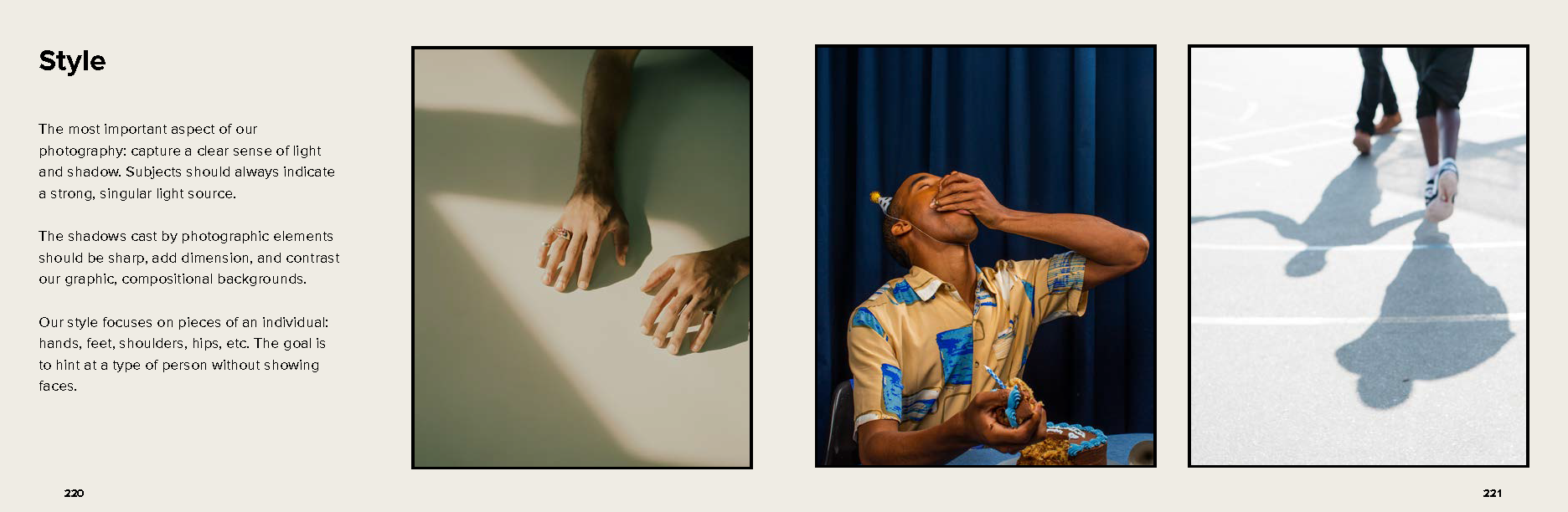
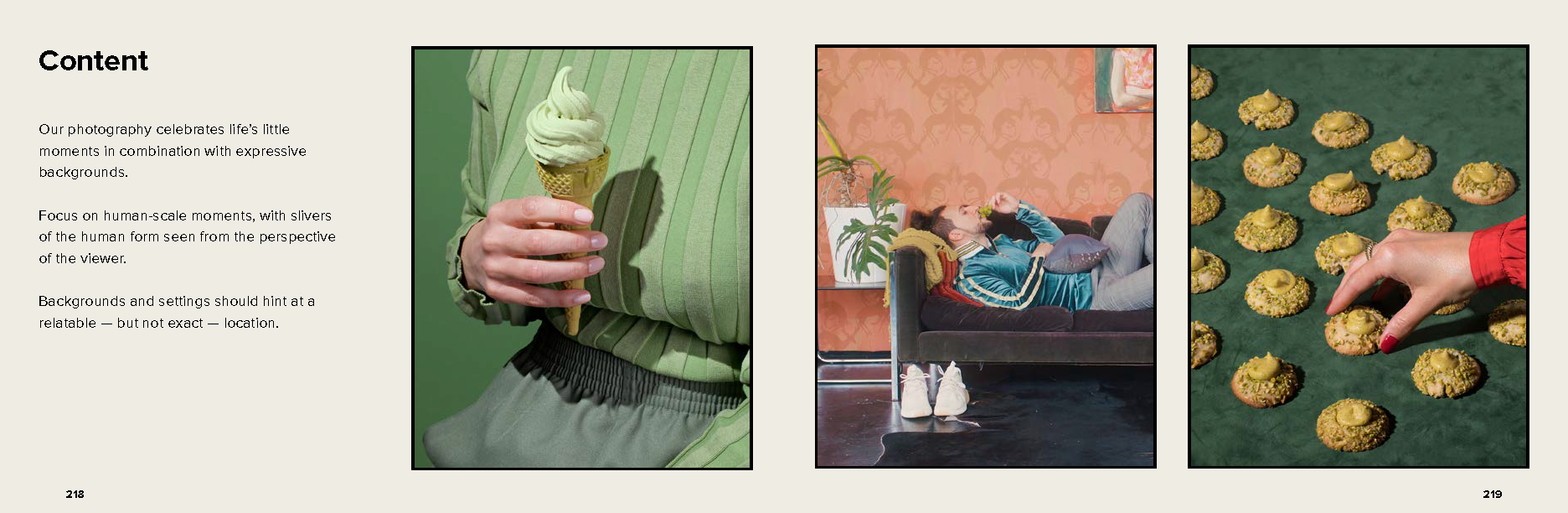
Photography
Lantern’s photographic style contextualizes and adds humanity to the brand identity. We aim to balance a first-person point of view with light, shadows, and human-scale moments throughout the photography. One major element to this is discretion as we didn’t want to show full face or head-on shots.

Combining Elements
One of my major priorities was to combined the defined photography style and shape system together.
It allows us to make imagery feel more “Lantern”.
Cost savings with reusing stock photography by adding new elements.

You can download the full Lantern Brand Book here to look into the brand positioning, voice, and other things I didn’t feature here.